Alucinantes ejemplos de tecnología Paralax en Websites. Iremos comentando en próximos posts
Nike Better World
Nike Better World is probably one of the early sites who started this parallax scrolling trend. Still looking good.

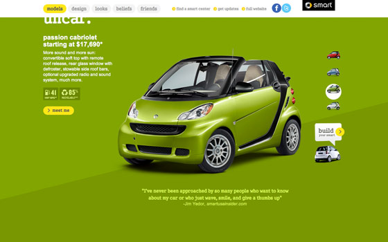
Smart USA
As you scroll down the Smart USA site, the elements zoom to you. What is really impressive is they managed to maintain the similar look and feel in their mobile version. Most parallax scrolling designs don't play well on mobile devices. Having a separate version is a smart idea.
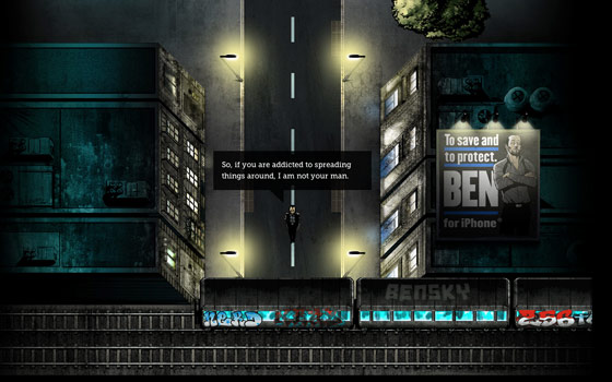
Ben The Body Guard
Although the perspective seems very wrong (it doesn't feel like a bird's-eye view) onBen The Body Guard, but having a character and trian runs across the scene is pretty cool.
Laurentius
I don't understand Dutch, but browsing on Laurentius site was very enjoyable. You can scroll through the slideshow with mouse scroll wheel, scrollbar, navigation buttons, or arrow keys. I particularly like the slide between 4 & 5 where the butterflies flew out the scene randomly.

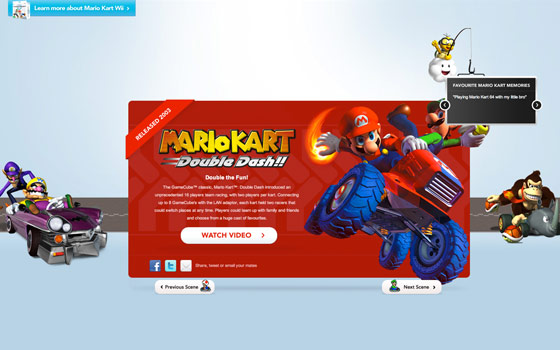
Mario Kart Wii
Mario Kart site gives you the same kind of experience as if you were playing on the Wii. It is fun to see the carts move on the track. Notice when you try to scroll down on the last slide or scroll up on the first slide, the graphic elements shake to create the effect of braking.
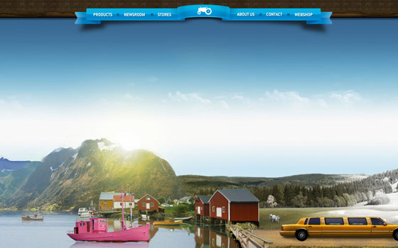
Moods of Norway
Moods of Norway truely depicts the beauty of a city line in a parallax scrolling tour. It takes you from the country side to the urban city in different lighting and season. I thought it is a travel site, but it turns they are a product site (LOL). Don't forget to check the site on your iPhone. It displays a sweet message when you are viewing in portrait mode. You can swipe through the scenes in landscape view.
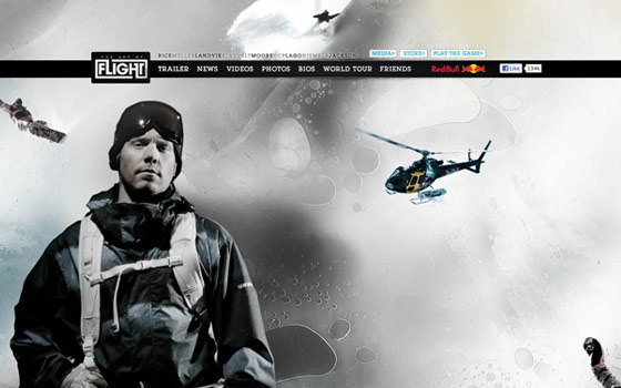
Art of Flight
Like the Mario Kart site, Art of Flight provides the same experience as if you were flying in a helicopter. It gave me a headache (in a positive way) from watching the elements flying around the scene. Very well done!
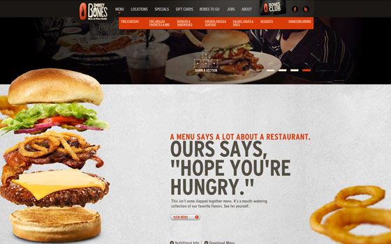
Smokey Bones
Beside the parallax scrolling on Smokey Bones, I like the bottom of the site where you can break the balls and play pool (well, sort of).
BeerCamp
BeerCamp doesn't have the stunning images like most of the parallax scrolling sites, but it is very well executed. Everything is laid on the screen. As you scroll, the design zoom in layer by layer.

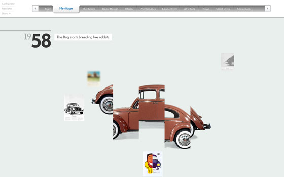
Beetle
Make sure you are on high speed connection to check the Beetle site because it is very graphic instense. The scrolling at the beginning is put together with image by image like keyframe animation.
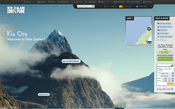
New Zealand
The scene design on the New Zealand site is breath taking — beautiful and high resolution imagery. However, this beauty costs some load time and graphic resources.
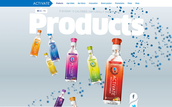
Activate Drinks
Among all the sites on this list, I think Activate Drinks has the best pre-load idea. First it shows you a nice loading animation and then the cap on the bottle starts turning as you scroll.
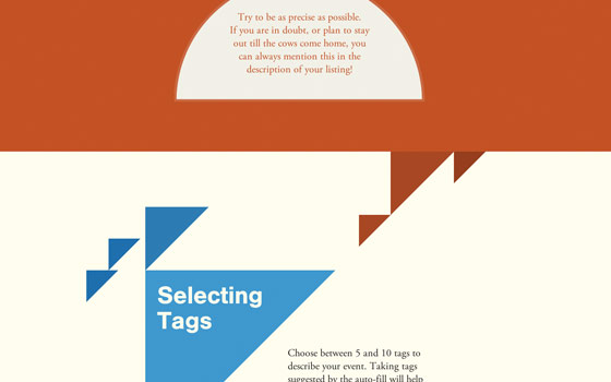
Gidsy - Making the Perfect Listing
This "Making the Perfect Listing" page is nicely put together with just basic color and shapes. Scroll and watch the shapes merge together.
'via Blog this'


